Brand concept · Visual identity · Brand applications
Smart Network Systems.
An International Smart Card (ISC) company.
A brand identity concept that turns the familiar action of TAB into a clear expression of progress.
Brand identity concept
A distinct identity.
A clear sense of direction.
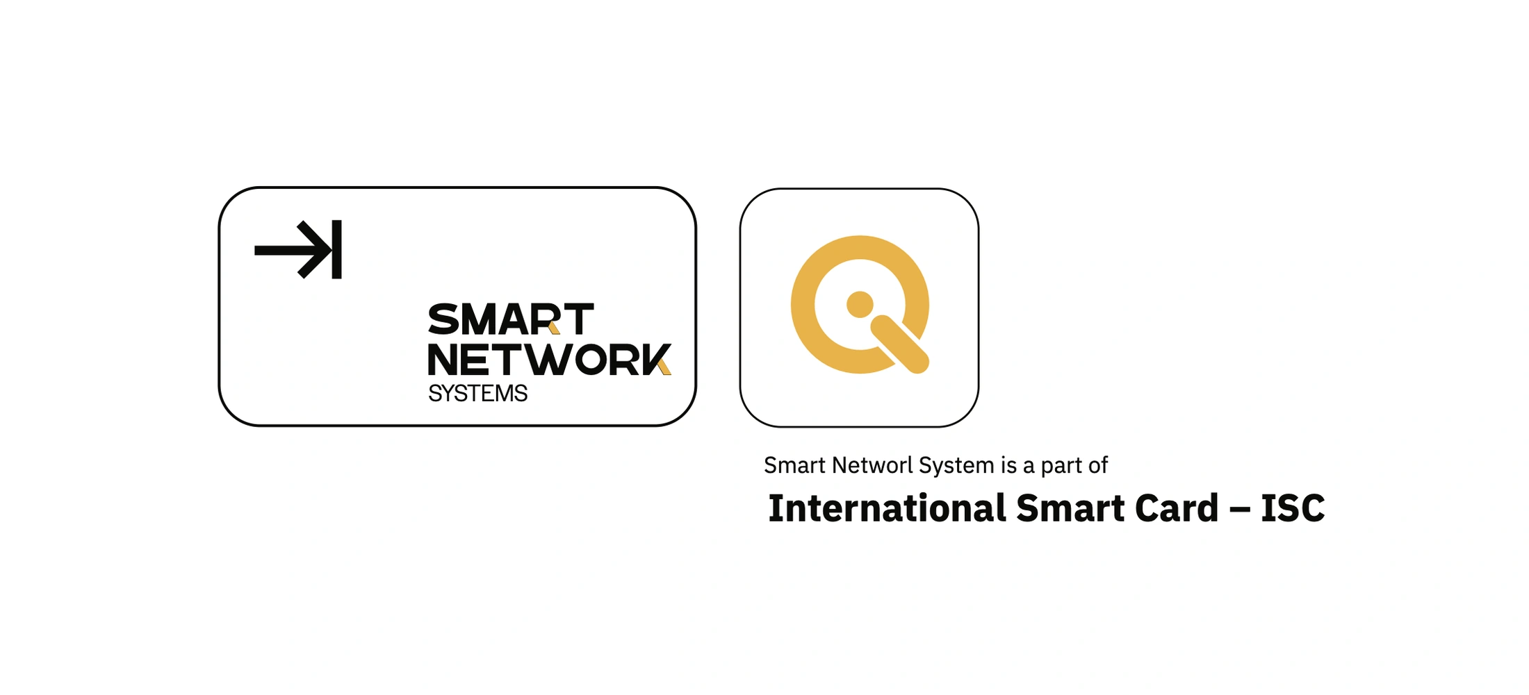
Smart Network Systems is one of the companies of International Smart Card (ISC). The concept explores a distinctive visual identity for its technology offering, built around a simple idea: helping organisations move from manual to digital, disconnected to connected, complex to simple and repetitive to automated.
How can a familiar digital action give Smart Network Systems a recognisable identity and express its focus on forward movement?
Move to
what comes next.
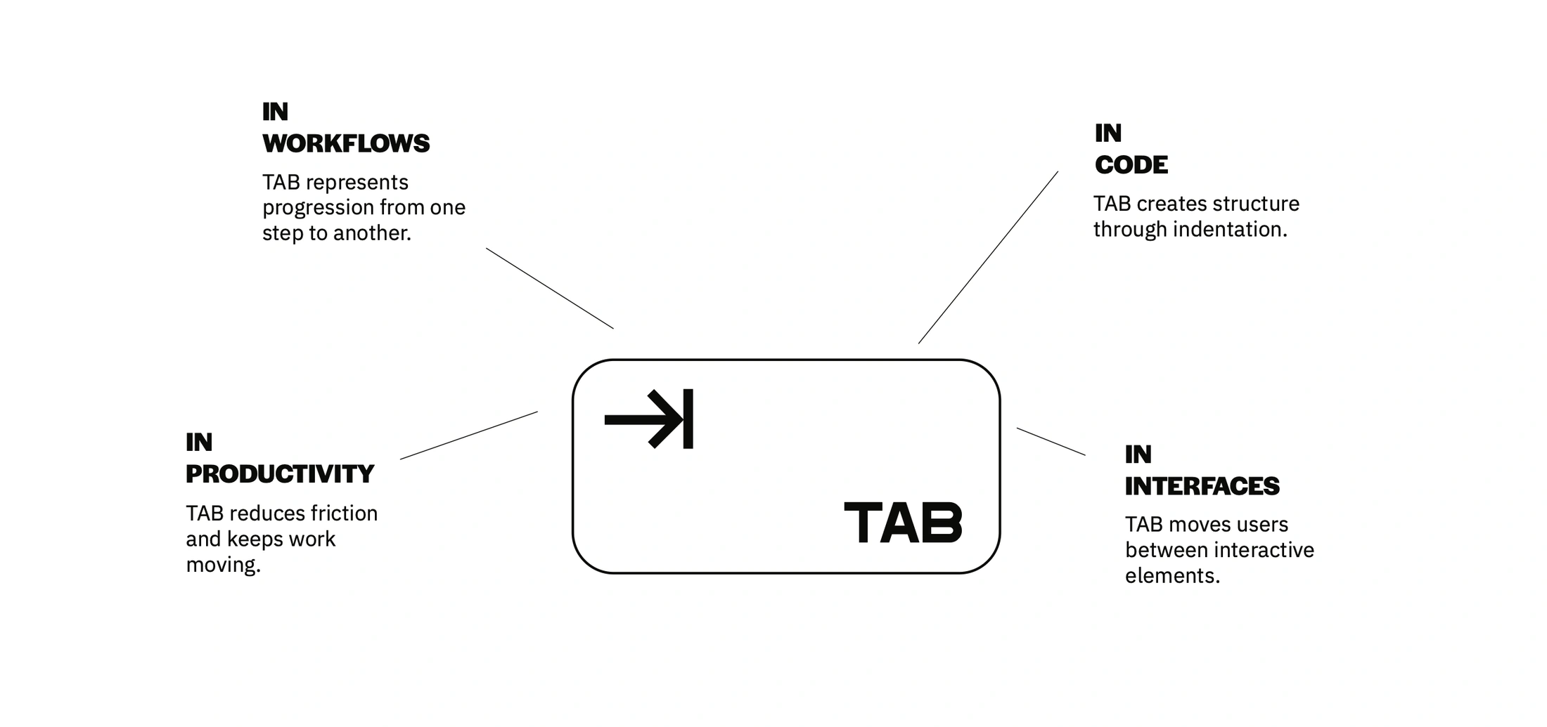
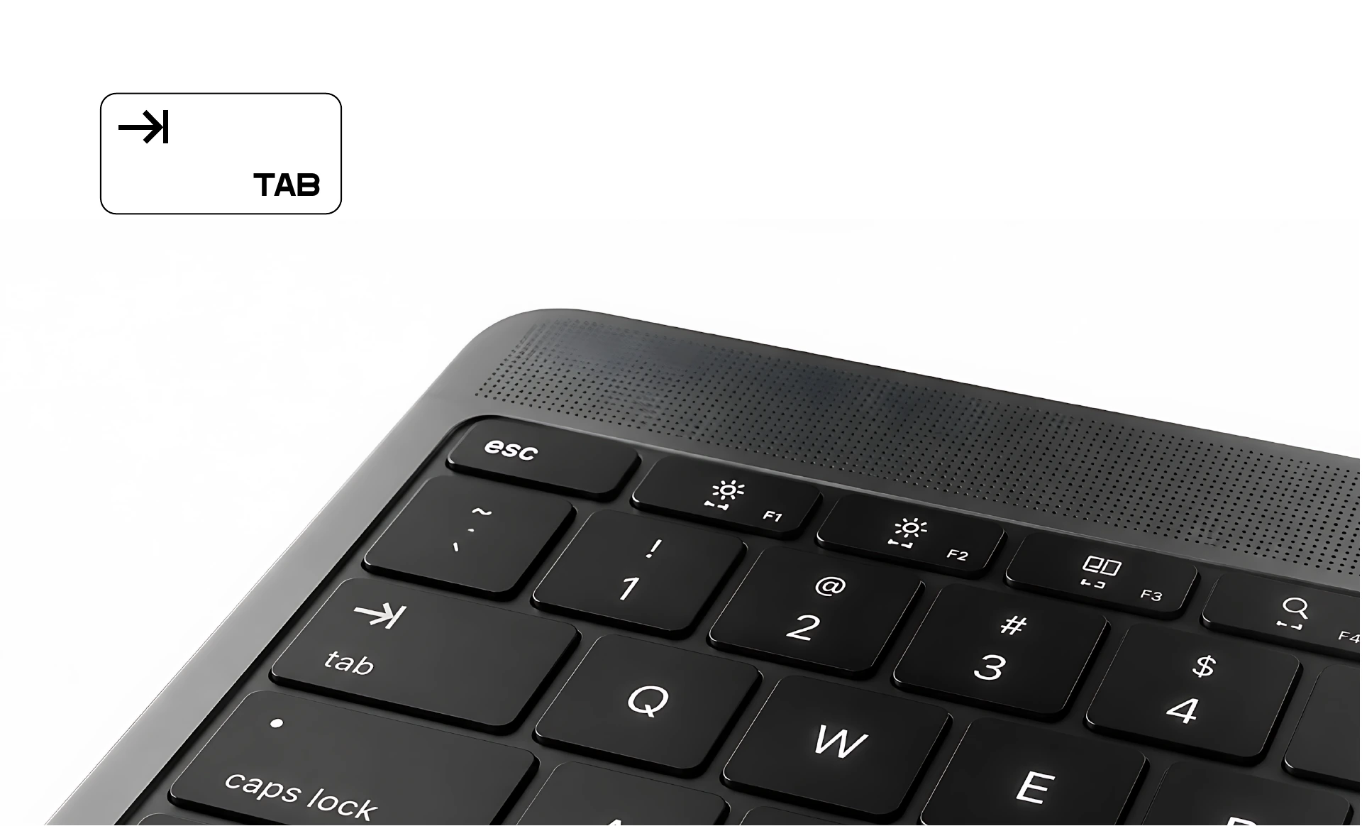
The concept begins with TAB. In code, it creates structure. In interfaces, it moves between elements. Across workflows, it represents progression. In productivity, it reduces friction and keeps work moving. The identity translates this familiar behaviour into a mark combining a forward arrow with a vertical boundary: direction meeting a new position.
- In workflows
- TAB represents progression from one step to another.
- In code
- TAB creates structure through indentation.
- In productivity
- TAB reduces friction and keeps work moving.
- In interfaces
- TAB moves users between interactive elements.
Connect the thinking
with the details.
We connected the brand concept, visual identity and applications around one idea: moving to what comes next.
Brand concept
Build the creative rationale around TAB as a symbol of structure, navigation and forward movement.
Visual identity
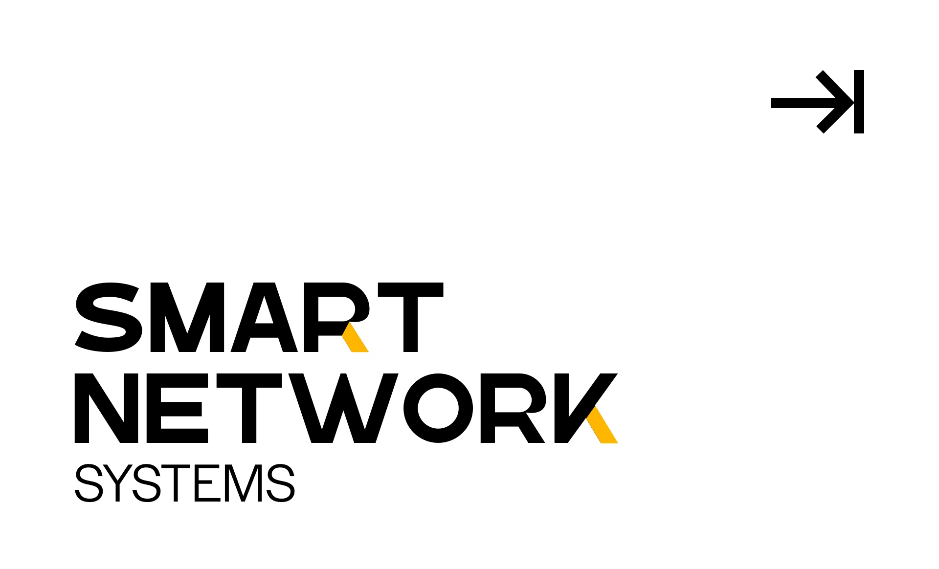
Translate the idea into a distinctive mark, wordmark, typography and a restrained palette with yellow accents.
Brand applications
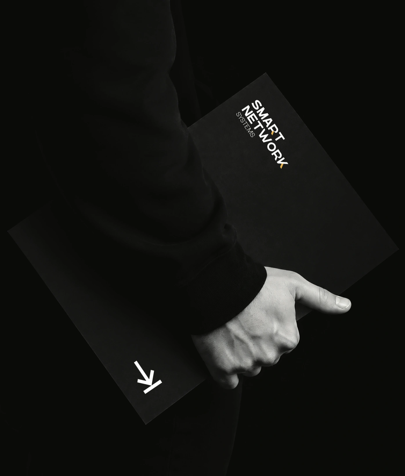
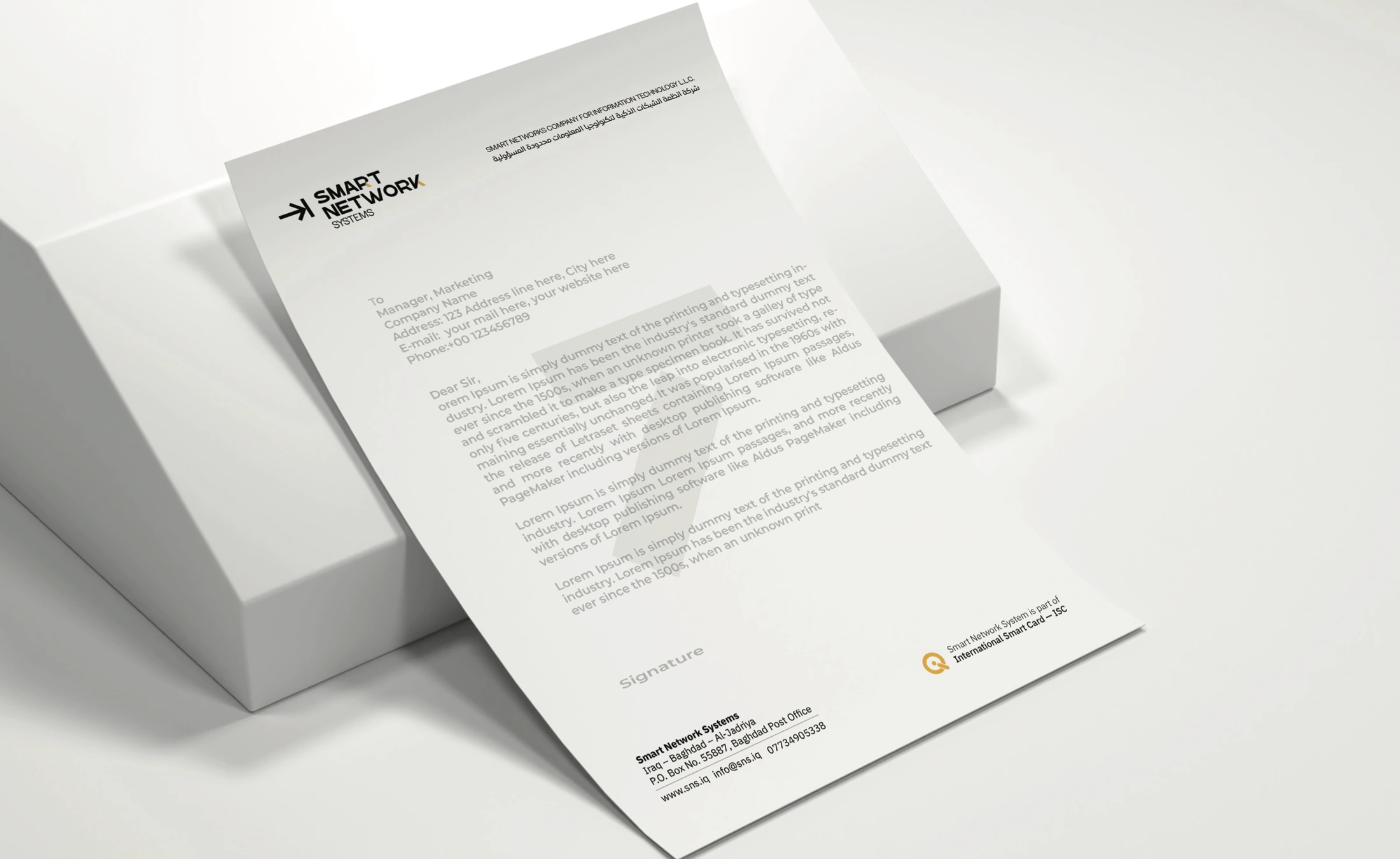
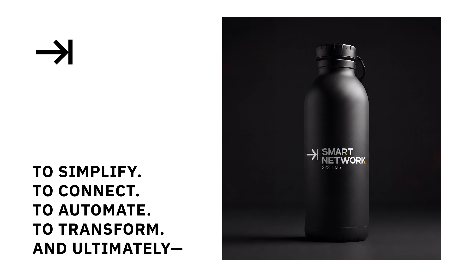
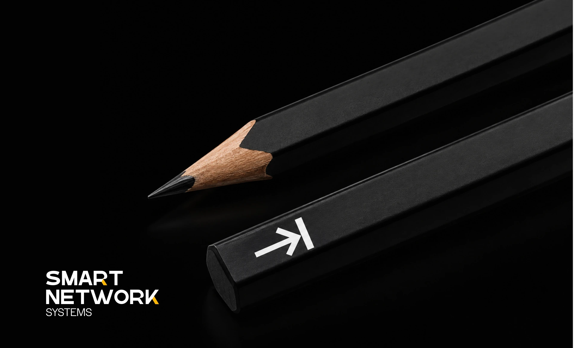
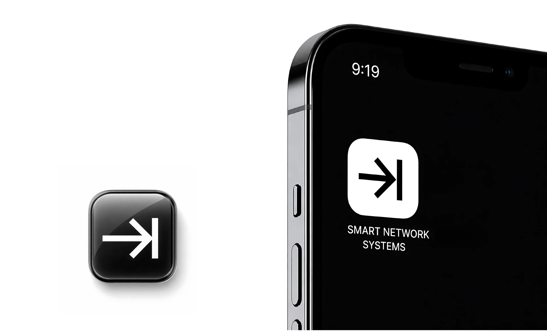
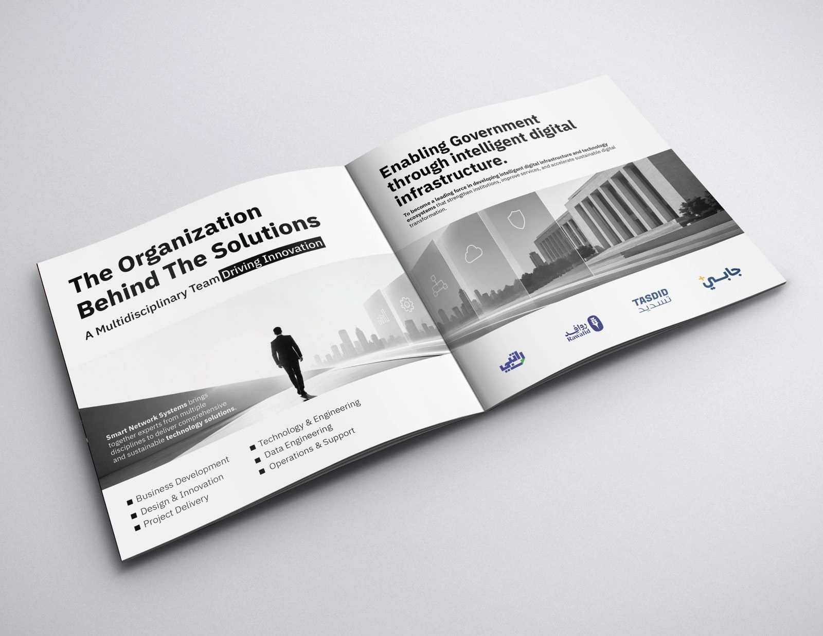
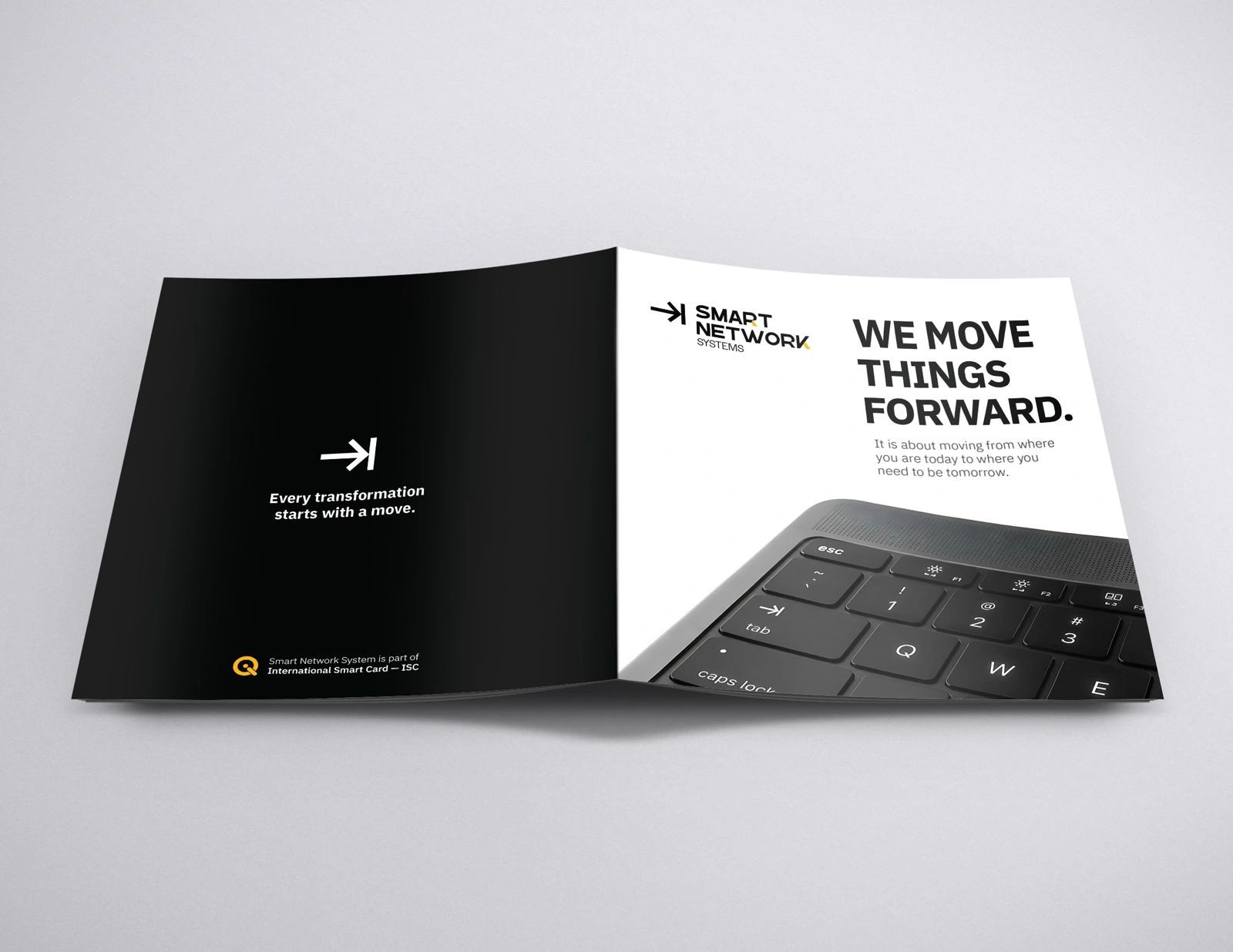
Explore the system across digital communication, apparel, stationery and everyday objects.
A simple mark.
A shared direction.
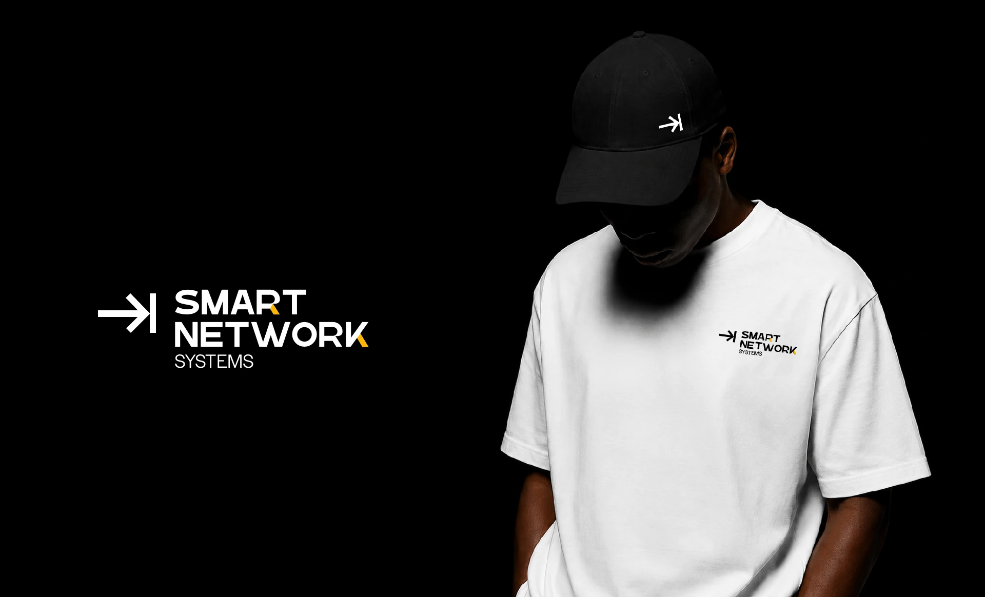
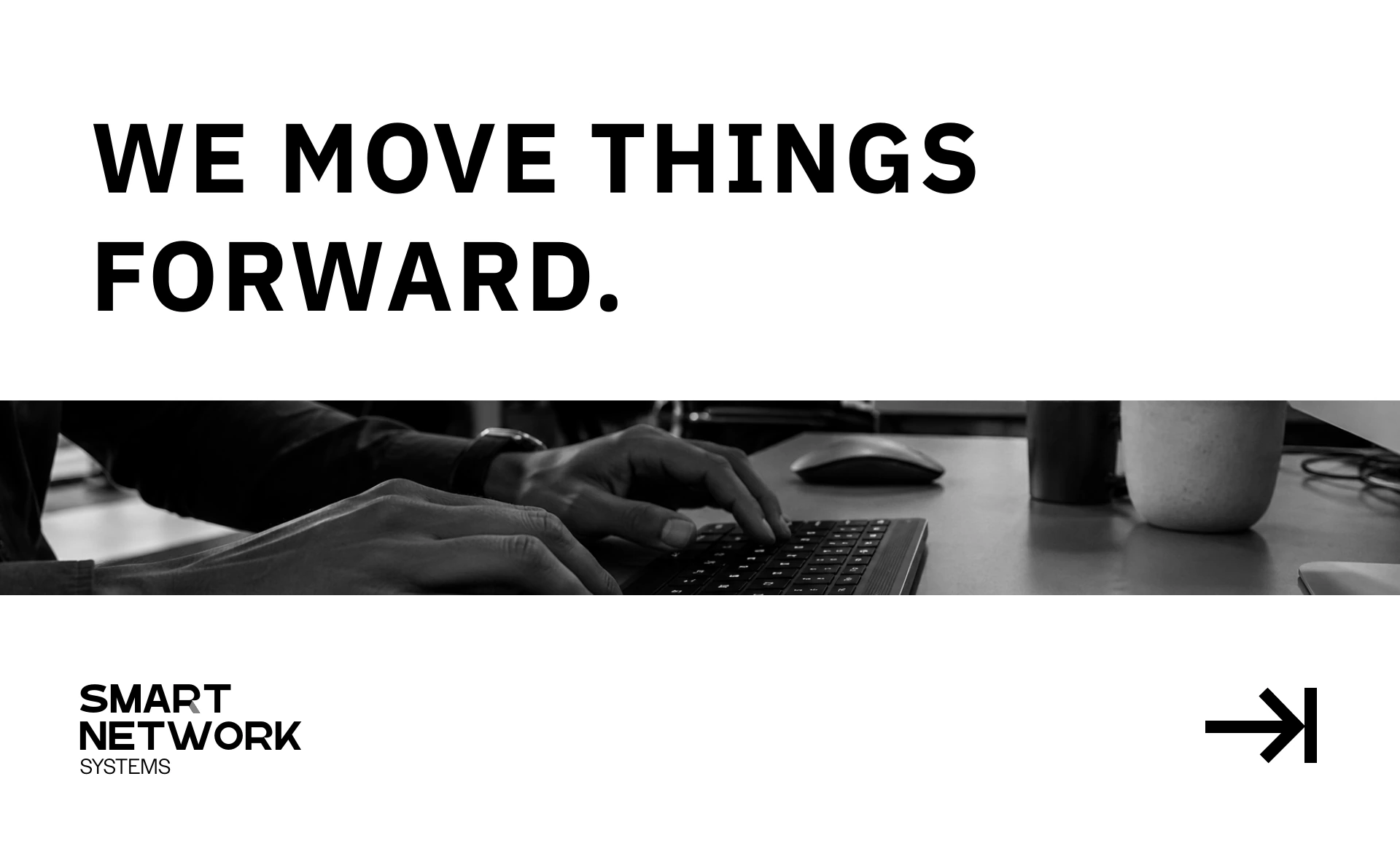
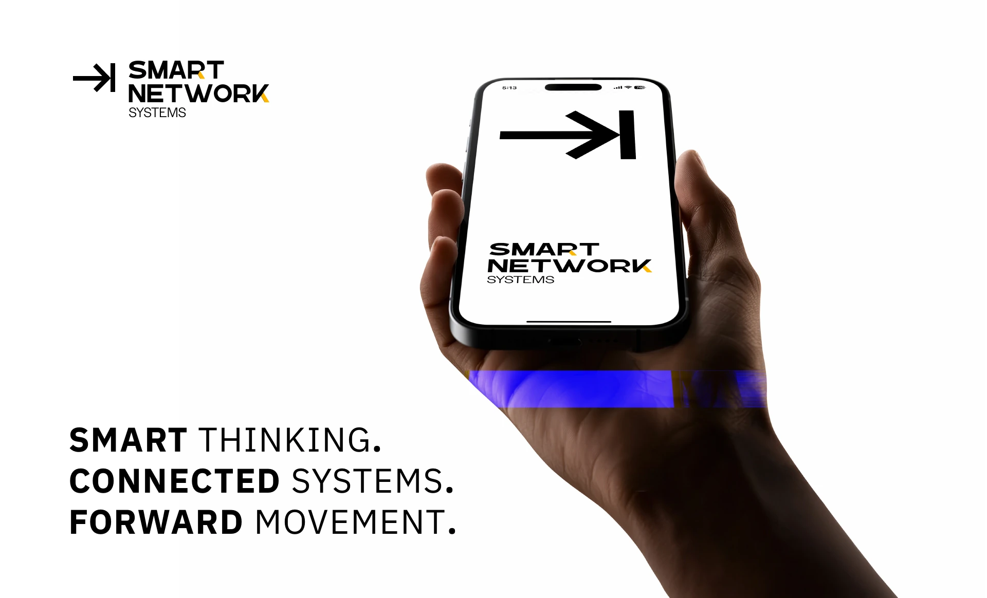
The arrow and vertical boundary give the identity a clear visual foundation. A black-and-white palette, small yellow accents and direct typography carry the idea across the wordmark and its applications.
From a digital icon to printed stationery and apparel, the concept connects messages about simplifying, connecting, automating and transforming. Each application expresses the same direction: moving forward.
Smart Network Systems · Brand identity concept.